
The Philips Georg Jensen TV – behind the screen with designer Rod White
What do you really know about all the different items you have in your living room? Why do they look the way they look? What went on during the design process? And how do you make sure they look every bit as good as the designer had in mind? I was…
What do you really know about all the different items you have in your living room? Why do they look the way they look? What went on during the design process? And how do you make sure they look every bit as good as the designer had in mind? I was lucky enough to find out when Rod White, head of the team that designed the new Philips Georg Jensen 9104 television dropped by for an in-depth interview. Now Patrick, I almost hear you think, didn’t you ban your old TV to your bedroom years ago? Well, I did, but a while ago I realized that I no longer wanted to go to bed whenever I felt like watching a show. On the other hand, of course, I didn’t want to ruin what I consider to be a near-perfect living room with a giant black rectangle. What I needed instead was a television that blends in and stands out at the same time. An exquisitely designed piece of furniture that also happens to be a TV, if you will. Enter the Philips 9104, which is developed together with Danish design brand Georg Jensen. Getting a spectacularly beautiful TV, however, is only part of the solution. After all, you also have to let it blend in with the rest of your interior. I’ll show you how I went about it in an upcoming article. For now, let’s find out more about Head of Design Rod White and his quest to keep Philips televisions at the forefront of European design.
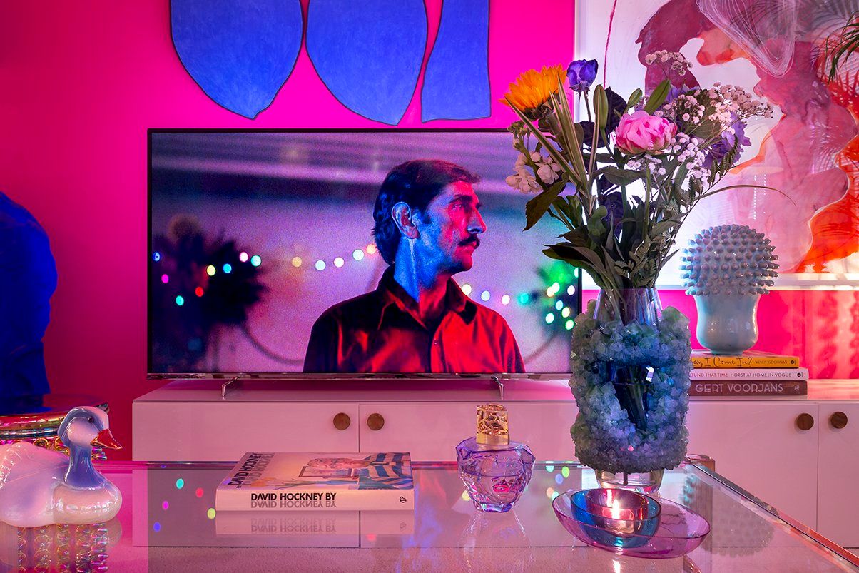
So exciting to have Rod White come over to my place for an interview! I added a Wool Island by The Soft World to my living room to create some contrast with the television Rod designed together with his team.
You’ve been designing Philips products for more than twenty years. How did it all get started?
When I was living in Tokyo in the 1990s, Philips had a touring show called TV at the Crossroads. I still have the book about the show in my office. They were taking the humble television, which was often only 14 inch if you remember, and showed concepts that added new meaning to what is usually a simple and straightforward product. It definitely sparked my interest. The forms and materials were quite innovative. Philips added furniture elements, fabric and even translucent materials years before Apple made its famous comeback with the iMac G3.
That sounds totally different from the current direction you’re going with Philips!
Meaningful innovation and new materials are still important to us. They’re part of our four design principles. TV at the Crossroads never led to any final products. This showcase showed the world what we could do as a brand.
How did a Scot like you end up in Japan?
When I was studying Furniture and Glass at the Edinburgh College of Art, the head of our design school had met an outward-looking designer from Toshiba. He wanted to work with designers in Europe. I submitted my portfolio and was lucky enough to be selected. I was the only non-Japanese designer at the company. Designer James Irvine had been there ten years before me, so everyone at Toshiba referred to him. And later on during my 4 years with Toshiba, Michael Anastassiades was an intern over from the Royal College in London. But for a good while, it was just me so ideal to be immersed in the Japanese design culture.
Getting the hang of Japanese must have been quite a challenge!
From the beginning, I accepted that things were not going to be easy. To be honest, I’m not the world’s best linguist. Lucky for me, Toshiba let me spend my first month fulltime in their training centre learning the language. And then after that, I took Japanese lessons twice a week. Expectations at Toshiba were very high, but everyone was also very helpful. That combination of pressure and support means you can learn fast.
I once spent a year living in Bordeaux and I felt very self-conscious when my French was still so-so. I was never able to say something funny in the moment. Did you feel the same way learning Japanese?
I’ve lived in cities around the world, but Japan was the only country that really had a barrier until I could speak the language. That being said, the Japanese sense of humor is quite similar to our British self-deprecating dry sarcasm.
What kind of products did you design for Toshiba?
I mostly worked for the heating and cooling department. Walls in Japanese houses tend not to be insulated, which means that many people don’t central heat. Instead, they heat locally. If your living room was Japanese, we wouldn’t have our shoes on. And that coffee table would have a heater under the table top. Everyone just puts their knees under it to keep warm – it’s a very particular kind of coziness. I also designed the pattern for what is called a hot carpet, which is basically a rug with an electric blanket underneath.
It all sounds very exotic for someone who has never been to Japan! Looking back, what is the most valuable lesson you learnt when you were there?
Professional product design skills, definitely. As an art college student, it’s all about open-minded thinking. You have so many options, it’s up to you what you want to learn. As a consequence, there is less focus on the skills that matter once you’re a professional product designer, such as knowing how to visualize things, understanding what plastic means or appreciating the precision that is needed for parts to come together. At Toshiba, there was a process. That was really beneficial for me when I moved to Philips. My new job felt like a breath of fresh air. At Toshiba, whenever one of the seven main Japanese consumer brands brought out a rice cooker or a vacuum cleaner with a heavily organic shape, we had to release something similar. If you wanted to push away from that as a designer, the marketing department had the power to say no. My move from Tokyo to Eindhoven proved to be a leap in more ways than one. Things were the complete opposite at Philips Design. Not that we necessarily needed to be different or never looked at the competition. Instead, we looked at consumer needs first and then made our own decisions.
Looking back at that time, which design are still particularly proud of?
In 1999, we released the 14PT3685, a 14-inch television we called New Vision. It finally allowed us to translate elements of TV at the Crossroads into an actual product. With its fabric and round forms, the result was quite radical. The New Vision even had little translucent feet with ambient light and an analogue clock that we developed together with German watch brand Junghans. The clock took its reading from the DCF77 time code transmitter near Frankfurt, which was very futuristic back then. It was the first time I worked with another brand at Philips. It was a fun project and it did well. At Saks Fifth Avenue in New York City, they even made a huge display with the New Vision. I was really proud of that!
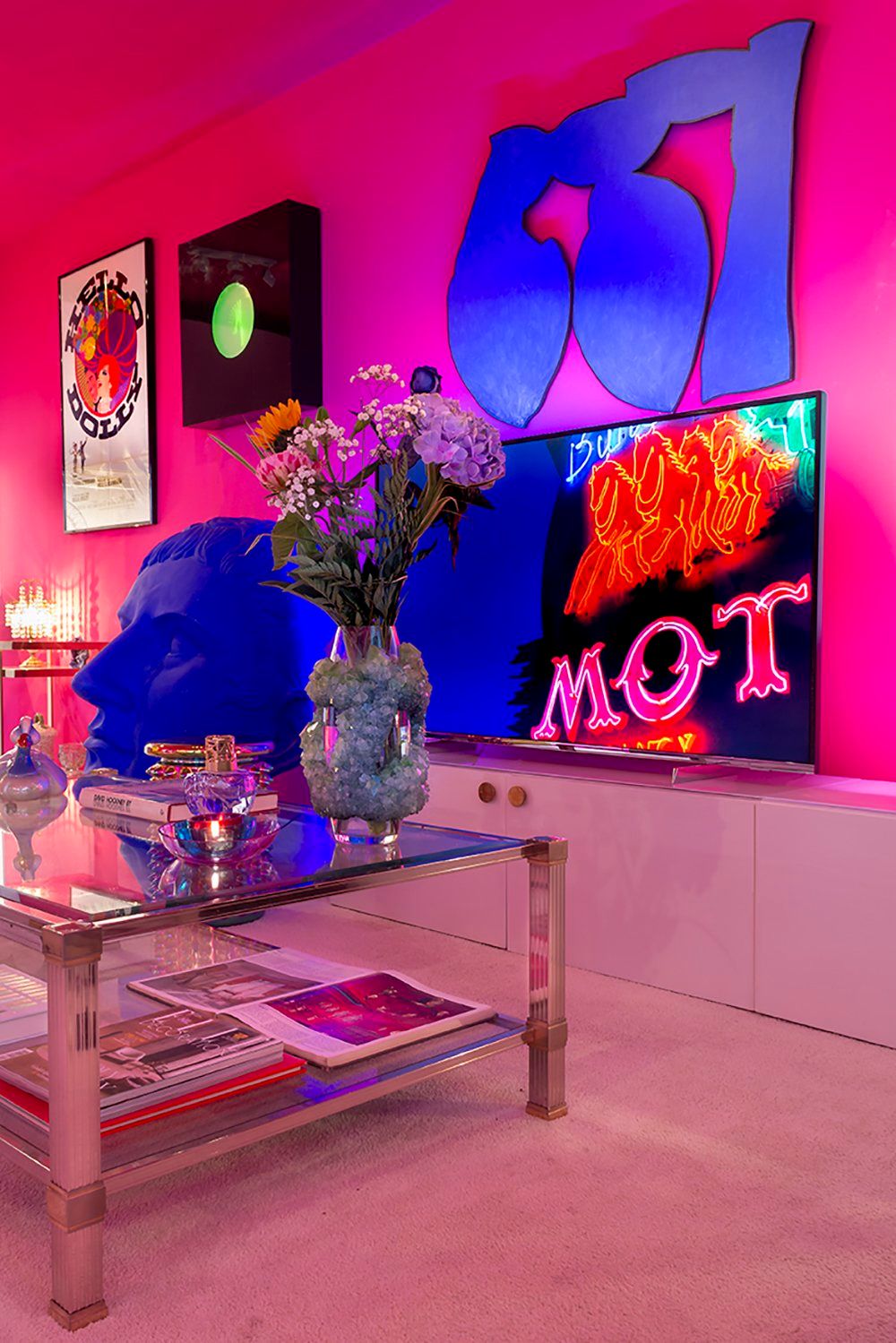
Paris, Texas looks amazing on the Philips Georg Jensen 9104, don’t you think?
How do you make sure you know exactly what people want in a TV?
Because our core television ranges have to be updated every year, we follow consumer trends very closely. It is the fuel for what we do. Next week, I’m doing a workshop for 2021 together with our team of product designers and our trend analyst designer who supports us. We extract a lot of ideas from Milan, but also from online resources from around the world. During our annual workshop, we put together everything we’ve seen and try to make sense of where we are compared to last year. We map how societal and aesthetic trends have morphed over the last twelve months. When a trend is too niche, we discard it. There are so many trends out there, but we try to limit ourselves to consumer’s homes. Our designs and the materials we use should be feeding into that. During our trend workshop, we don’t necessarily focus on technology – that is something that comes in year-round anyway. We end up creating a digital book that provides us with inspiration not just for the annual updates to our TV ranges, but also for new products we think consumers need. Children’s headphones or a smart Bluetooth device that you can speak to can be a good starting point to go back to our book and look at trends in forms and materials. We don’t just rely on images we’ve found online. After all, you can’t show those in public. Instead, we create our own images for each trend that we have identified. We use those original images not just for presentations, but also product launches and exhibitions.
Fascinating stuff! Could you give me an example of how a consumer trend influenced your team’s design work?
A few years ago, the recession was a very clear trend. You could really see how the mentality of consumers changed. They were spending more time at home, didn’t have the spending power they once had and also didn’t want to look like they were wasting money. You could see that coming into the product. If you remember, there were a lot of skeletal shapes three or four years ago. It was something that started in Milan a few years before that. We used elements of that trend in some of the television stands we designed at the time. In the end, however, our principle is that our work has to be understated. After all, as televisions get bigger and bigger, you need to be more reserved.
Is that true? Does the design of a television always have to be understated?
We’ve got something coming up in the second half of this year that is quite in your face – even though it’s not bold for the sake of being bold. Televisions used to have quite thick bezels. Just as the economy crashed in 2009, we released a TV called Flavors that gave people the option to do whatever they wanted with that space. We offered interchangeable frames with different colors and patterns that you could update. Unfortunately, Flavors never really took off. It works on a customizable phone case, but a television is more of a shared object. And most people don’t want a red, striped or patterned television, anyway.
Do you see a clear link between societal trends and aesthetic trends?
That link is mostly geographical. European aesthetics are quite different from what people in Asia find pleasing to the eye. A while ago, we thought everything was converging, but that didn’t turn out to be true. That’s why we do create a global range but still design separate products with that for different parts of the world. It’s very difficult to create a global range when there’s such a desire to have different products.
Do you also look at the past as a source of inspiration?
Together with Febrik, a Tilburg-based company that is part of the Kvadrat Group, we’re working on some audio products that are coming out later this year. The technology of their fabric is like a big knitting machine. They spin the fabric into this big sock which they then cut and shape. That is a craft we’ve been using for hundreds of years. If you think of speaker cloth, it used to be this black and shiny, almost alien material. That goes very much against what you would bring into your home. Together with Febrik and Kvadrat, we’re working very hard to create something that actually makes sense from an interior design perspective. You have to come to IFA to find out what it is. Another project where the past served as an inspiration, is our new Philips 9104 that we designed together with Georg Jensen. As you can see, the forms in the lower area of go back to the 1950s and 1960s.
How did the collaboration with Georg Jensen come about?
Philips is about European design first and foremost. And that is why we started looking for other quintessentially European companies that we could create synergy with. As you know, TV’s get thinner and thinner and the space for a good sound gets less and less. We wanted to deliver an ultimate sound performance machine, which is why our first collaboration started with Bowers & Wilkins. The fabric we’re using on the TV’s is custom-made for us by Kvadrat. Getting the look and feel just right wasn’t our only challenge. We went through eight different options before the fabric was acoustically transparent enough to earn Bowers & Wilkins’ badge of approval. Regarding Georg Jensen, we launched our first joint product this year. Our companies have a lot in common. They are about the same age and share a similar history. Also, Georg Jensen is known for bringing together precious materials in beautiful products. They have an amazing archive in Copenhagen with everything they have made over the last one hundred years. By now, it is a national treasure, so pretty high security. But when you’re in there and the drawers are open, it is a treasure trove. And that is where we found the inspiration for the stand of the Philips 9104. Normally we don’t work with precious metals, but luckily, the designers at Georg Jensen helped us a lot.
The design of the 9104 is very recognizable, especially the two feet it stands on. How many options did you explore before you decided on the final design?
There’s a smithy at Georg Jensen. We spent some time there, exploring the different techniques they use to make their products. Cross hatching, for example, is part of their brand signature and one direction we did explore. We also looked at bringing together warm metals and cold metals in one design.

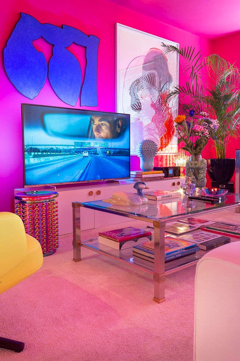
I didn’t want a giant black rectangle to dominate my living room and so, I came up with a few tricks that would make it blend in. I’ll tell you all about them soon.
That sounds interesting!
We had about six concepts to choose from. And we were happy with them all. When we took into account sales realities and production techniques, we ultimately decided on this particular design. We love the synergy between our brands. Of course, we hope that consumers, who are looking for Georg Jensen products, suddenly stumble upon our television – and vice versa.
Does keeping in mind commercial viability and production techniques ever feel like a restraint?
No, not really. Dieter Rams had ten principles of good design that have been unofficially driving Apple for many, many years. We in our team wanted to bring them back to four, so that we could talk about them easily in our design team, with our marketing team and in the media as simply as possible. Our design principles allow us to communicate why we make certain choices. They also make it easier to underline our message of European design. I’ve always admired designers who do a lot with very little. When I was a student, Hans Wegner was a big inspiration. Jasper Morrison’s work is also very paired down – even though it has very elegant forms. I don’t like simplicity for the sake of simplicity. There has to be usability in the pieces that we create.
Is there anything in particular that you as a designer learnt from Georg Jensen?
At Georg Jensen, it’s all about the preciousness of the material. It is a brand that lives in everyone’s heart in Denmark. Just look at the silver flagpoles so many people get as a birthday gift and you know what I mean. Georg Jensen’s most expensive product is a fish dish that is hand-made by one man over six months. It’s an amazing piece of European craftsmanship. Also, their in-store presentation is very premium. The attention to detail at Georg Jensen really is next level. For example, did you notice how subtle the branding is on the polishing cloth that came with the TV? Also, if you installed it yourself, I’m sure you noticed how the stand and the plate you use to attach it to the TV are designed to be two separate parts, which is something we normally do not do. Keeping the stand separate, however, allows you to save it as a paper weight when you get your next TV in ten years down the line. It’s a nice link to the Georg Jensen brand. In today’s society, we want to re-use as much as possible.
I’m lucky enough to be one of the first people to try out the Philips 9104 at home. Could you tell me why it comes not with one, but two remote controls?
Most people who buy a large screen television are part of a family, or a couple. We decided on two different designs. The first one is a traditional multi-key remote control. The key layout is a conglomeration of many things. In some regions, for instance, people are used to function keys – even though you might never use them. Personally, I think it has way too many keys. But it’s the aggregation of what everyone expects. When we brought in Smart TV, we were the first to add a QWERTY keyboard on the back for ease of use.
The second remote control you designed together with Georg Jensen truly is a beauty. It’s so understated that it took me a while before I even realized it had a touchpad. I also have to admit that it takes some getting used to talking to a device that looks like a magic wand.
In China, there are so many products with voice recognition that consumers have no concerns. Because Europeans tend to be a bit more nervous about who is listening, we made a very conscious decision to include a voice control button on the second remote control. It turns on Google Assistant when you press it.
Speaking of which, why did you choose Android as the operating system?
Until five years ago, we used internally developed platforms. We realized, however, that it became too difficult to constantly update the apps that were needed. The simplest and most solid solution was switching to Android. The best-selling mobile phones in the world have Android installed, so it was an easy decision. Google’s voice recognition is also really good. As a Scottish person, I remember there were some problems a couple of years ago where Apple’s Siri voice assistant didn’t understand the Scottish accent. Android, however, is always improving itself.
I’m sure I won’t be able to live without Google Assistant in a few months’ time! That being said, there have been so many technological developments these past few years that some of them can feel a bit gimmicky.
It seems there’s something new and hyped every year, doesn’t it? At one point, it was 3D – that never really took off. Curved screens were the next big thing, even though nobody has a curved wall in their house. I remember meeting a property developer in London who had made a curved wall that matched the radius of the television that was going to be installed.
The base of the Philips Georg Jensen 9104 is really what sets this European television apart from the competition.
Let’s hope it never breaks down! What do you think of the other new concepts that are coming out now?
We never push technology, that’s basically our ethos. We listen to consumers first and constantly ask ourselves if our product meets their needs at the right price. Rollable displays may seem amazing at first, but they are going to be so exorbitantly expensive. Another thing we’ve been studying is transparency. It’s a benefit when the TV is off, but the quality when it’s on is mediocre. For now, it doesn’t make sense to launch a transparent television.
I guess the dilemma is to either design a television that is really striking or something that tries to blend in and looks like a painting or something.
I’m very mindful of the fact that everybody thinks they’re a designer. After all, we all create our own home. In consumer tests, we hear from many people who don’t like having a big, black rectangle in their living room. Which is fair enough, because TV’s keep getting bigger and bigger. In Europe market testing, we started with 32-inch models and slowly crept up to 46. Right now, 65 inch is the reference point. That would have been unimaginable ten years ago. In America, 88 inch is the established size for Premium. Also, as bezels got thinner, the amount of product design on the front got less and less. That stand or even the remote control is where the differentiation lies.
What practical tips and tricks can you share with people who want to blend in their TV with the rest of their interior?
Our Ambilight system can be very helpful in that respect. It makes the contrast between your TV and the wall behind it a lot less harsh. You can even link it to your Hue bulbs. They follow the content, which is especially interesting when you’re watching dynamic content such as sports or action movies.
That’s all very well, but my TV is turned off most of the time.
Did you know that you can switch the Ambilight on even when the TV is off? You can use it as ambient lighting. When you first install your TV, it even asks you the color of the wall behind it so that it can adjust the Ambilight. Just don’t put too much clutter around it. If you do, the Ambilight can be more agitating than comforting. If you have tartan wallpaper for instance, it’s probably not going to work. Another thing you have to keep in mind is the middle of the screen has to be eye-height when seated. Some people like the idea of putting up a TV over a fireplace, but that means you neck is so angled, it’s not very comfortable over a long viewing time.
I’m looking forward to spending more time with the Philips 9104!
I think we really managed to do something outstanding with Georg Jensen. The remote control alone puts a smile on people’s faces. Together, we’ve created very solid yet discreet European design statement.
Do you want to know how you let a TV such as the Philips Georg Jensen blend into your living room? I’ll tell you all about next week!